Color Wheel and Opposites – Mastering the Art of Complementary Colors in Design and Decor
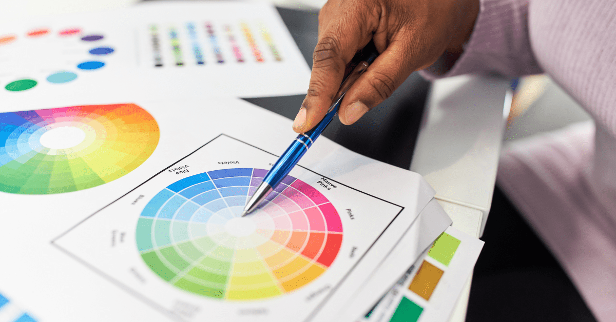
Delving into the realm of design and decoration, the color wheel emerges as a pivotal tool, guiding creators in their quest for harmony and visual appeal. This circular diagram elegantly organizes hues in a way that showcases their relationships with one another, providing an invaluable foundation for making informed decisions about color combinations.
It’s fascinating to observe how adjacent colors can create a sense of unity while those positioned as opposites on the wheel can introduce dynamic contrast, breathing life into a space or design. This interplay of colors, rooted in the principles of the color wheel, offers endless possibilities for creativity and innovation. Understanding Primary Colors – The Building Blocks of the Color Wheel
Photo Credit: Canva Pro
When exploring colors, it’s fascinating to see how the simple act of mixing primary colors can lead to the creation of a vibrant spectrum of secondary colors. This process, rooted in the principles of the color wheel and opposites, reveals an intriguing interplay between hues. For instance, when you blend blue and yellow, the result is a lively green. Similarly, mixing red and blue yields a rich purple, while combining red and yellow produces a vivid orange. These secondary colors add depth and complexity to our ...
| -------------------------------- |
| Live talk on perfection in art and design with No. 3 Gin |
|
|