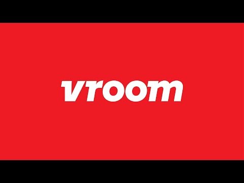
Pentagram evokes speed with branding for online car shop Vroom
The silhouettes and movement of speeding racing cars influenced the slanted lettering of this wordmark, designed by Pentagram's New York office as part of a rebrand for an online auto trader.
Pentagram graphic designer Michael Bierut led the team that rebranded Vroom, an online retailer for buying, selling or trading-in vehicles.
The designers wanted to let the company's onomatopoeic name "do the work", rather than using imagery of cars or driving. They therefore created a new white and red logo intended "to evoke a feeling of forward motion and driving a car".
Set against a "sporty" red backdrop, the name is written in a white using thick, italicised lettering in a typeface called Vroom Sans.
London-based type foundry A2-Type adapted its Regular Extrabold Italic typeface specifically for the project.
Letters are placed at a slant and feature curving descenders ? the parts of the letters that drop below the base line ? to suggest motion. Other new flourishes are the trailing slab serifs that Pentagram likens to the fins of racing cars.
Read more on Dezeen: https://www.dezeen.com/"p=1270388
WATCH NEXT: Pentagram models US Library of Congress logo on bookends in major rebrand - http://www.dezeen.com/"p=1255272
Subscribe to our YouTube channel for the latest architecture and design movies: http://bit.ly/1tcULvh
Like Dezeen on Facebook: https://www.facebook.com/dezeen/
Follow Dezeen on Twitter: https://twitter.com/Dezeen/
Follo...
Source:
dezeenmagazine
URL:
https://www.youtube.com/user/dezeenmagazine
| -------------------------------- |
| Interiors project of the year is "resolving space through furniture" say Dezeen Awards judges |
|
|