Herman Miller unveils first rebrand in over three decades
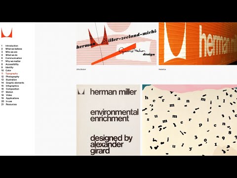
New York design studio Order has created a nostalgic new brand identity for Herman Miller that hearkens back to the mid-century modern heritage of the American design brand.
Last updated at the dawn of the World Wide Web in the late 1990s, the branding previously featured the "computer-friendly" FF Meta font and the company's enduring M logo from 1946, emblazoned on a red circle.
Tasked with bringing this identity into the 21st century while staying true to Herman Miller's legacy, Order took inspiration from the brand's own history ? specifically the modernist branding that was introduced by graphic designer John Massey in the late 1960s.
Much like this predecessor, the updated logo now features a Helvetica-style font while the swooping M symbol was once again freed from the confines of its circular backdrop so it can be used as a graphic design element rather than just a trademark.
Read more on Dezeen: https://www.dezeen.com/"p=2022917
WATCH NEXT: The IOC reveals new brand identity for the Olympic Games - https://youtu.be/ZeCthbAUlK0"feature=shared
Subscribe to our YouTube channel for the latest architecture and design movies: http://bit.ly/1tcULvh?
Like Dezeen on Facebook: https://www.facebook.com/dezeen/
Follow Dezeen on Twitter: https://twitter.com/dezeen
Follow us on Instagram: https://www.instagram.com/dezeen/
Check out our Pinterest: https://www.pinterest.co.uk/dezeen/
...
Source:
dezeenmagazine
URL:
https://www.youtube.com/user/dezeenmagazine
| -------------------------------- |
| CONSTRUCCIÃN DE UN TRAPECIO. Tutoriales de Arquitctura. |
|
|